Making a complex tax engine understandable
At Avalara, I worked as a Senior UX Researcher on products that help businesses calculate, collect, and remit sales tax. The core challenge was that customers thought they were buying a complete solution that would take sales tax off their hands. In reality, Avalara was more like a powerful machine: it could do the work, but only if customers understood how to set it up, monitor it, and maintain it.
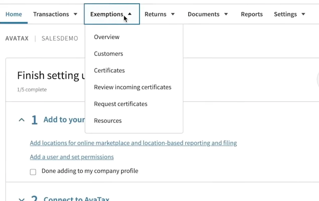
That gap between expectation and reality created anxiety. Customers needed to make decisions about nexus, registrations, tax codes, connectors, exemptions, returns, reports, and integrations—often without enough tax expertise or a clear mental model of how Avalara’s systems worked together.
What I did
I used research to make this complexity visible.
I combined customer interviews, support tickets, GoLive feedback, session recordings, surveys, and product analytics to understand where customers were getting stuck. Across projects, a pattern emerged: many problems were framed as “usability issues,” but the deeper issue was often conceptual. The interface could be clear, but customers still did not know what information to enter, what decisions were reversible, or what would happen downstream.
For self-serve onboarding, I watched real customer sessions in FullStory and organized recurring watch parties with product, design, engineering, and GoLive teams. I created dashboards and segments to track full-page errors, filed bugs, and brought the issue into executive review meetings. In one analysis, roughly 10–20% of onboarding sessions were encountering serious errors or blocked progress, which helped shift attention from polishing prototypes to fixing the released experience.
I also worked closely with customer-facing teams. GoLive and support teams had spoken with thousands of customers, but their knowledge was often siloed. I ran workshops, synthesized their feedback, and advocated for them to have a direct seat in steering meetings rather than filtering everything through UX research.
Reframing the problem
One of my biggest contributions was reframing product questions.
For example, teams often asked whether users could complete a flow in a Figma prototype. But in Avalara’s domain, prototype testing could be misleading: participants might say a design was easy, while real customers later struggled because they lacked the tax, integration, or system knowledge required to make decisions confidently.
Instead of asking only, “Can users click through this?” I pushed teams to ask:
-
Do customers understand what decision they are making?
-
Do they know what happens next?
-
Do they know what can be changed later?
-
Do they understand how this step affects downstream tax calculation, filing, and reporting?
-
Are we giving them enough confidence to proceed without hand-holding?
This helped teams see onboarding not just as data collection, but as education: a chance to teach customers how Avalara works.
System diagram as product vision
My favorite piece of work at Avalara began as a way to understand the product myself.
Avalara’s system was distributed across many components—often inherited through acquisitions—with different interfaces, support paths, and mental models. Customers had to use these components together, but its menu-driven UI did not show how they were related.
So I started drawing diagrams.
I modeled Avalara like an industrial process: transactions enter the system, flow through connectors, tax profiles, nexus settings, tax codes, exemptions, returns, and reports. Each component has a state, and each affects what happens downstream.
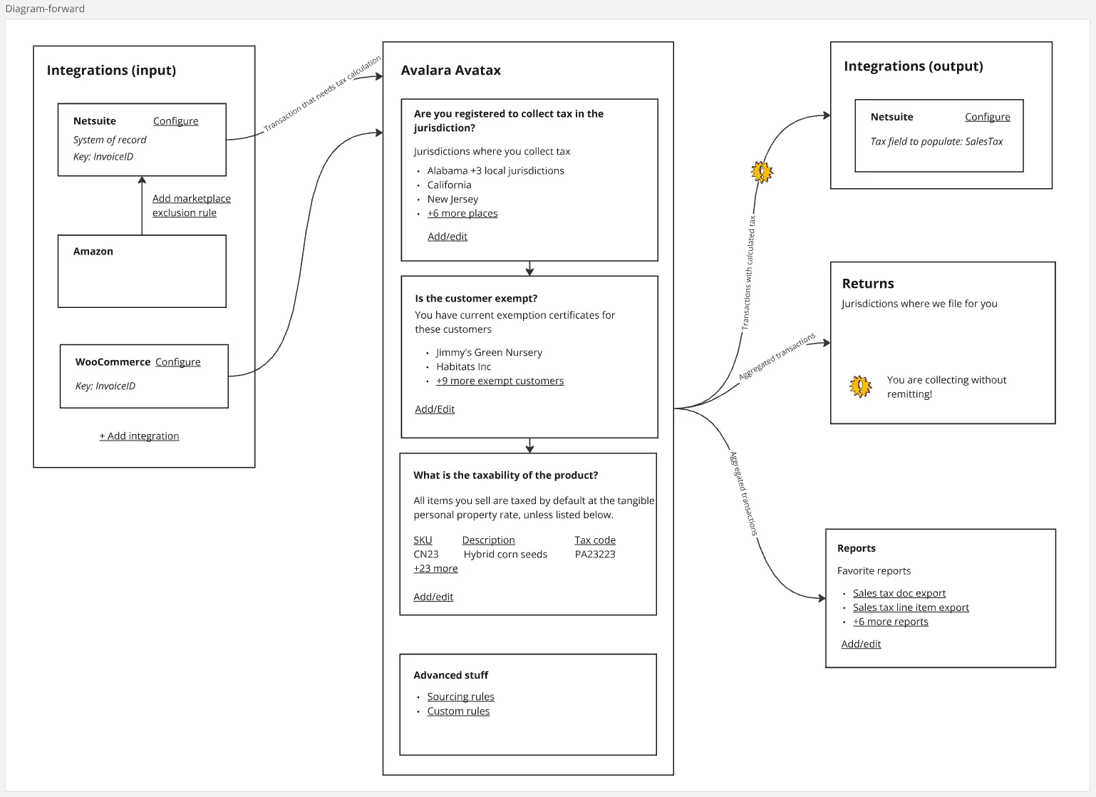
That diagram became more than a learning aid. It became a design concept for a dashboard where the diagram itself was the UI—a transparent, self-documenting interface that could show customers how the system worked, where they were in setup, and what needed attention. It was inspired by control-room dashboards, SCADA systems, train yards, hybrid car energy displays, and other interfaces that make invisible systems visible.
The idea was simple: if Avalara is a machine, the product should help customers see the machine.
Impact
My work helped teams move beyond surface-level usability fixes toward a deeper understanding of customer confidence, system transparency, and operational readiness.
Some outcomes included:
-
Identified serious onboarding errors through FullStory analysis and escalated them into executive review.
-
Helped product teams understand why released experiences failed even when prototypes tested well.
-
Built continuous research practices, including customer interviews, Dovetail repositories, tagged pain points, and recurring synthesis.
-
Trained PMs on interviewing and hypothesis-driven discovery.
-
Created developer personas and opportunity trees with product teams.
-
Helped delay, redirect, or cancel projects when research showed the problem or solution was wrong.
-
Elevated GoLive and support feedback so customer-facing teams could influence product strategy directly.
-
Developed a systems-oriented product vision for making Avalara’s complex tax engine more understandable.
What I learned
Avalara taught me that in complex enterprise software, the hardest UX problems are not always about screens. They are often about systems, expectations, and mental models.
A clean interface is not enough if the user does not understand the domain. A simple form is not enough if the user does not know what the fields mean. A self-serve setup flow is not really self-serve if customers still need an expert to tell them whether they made the right decisions.
The work made me more interested in designing tools that reveal hidden systems: interfaces that do not merely let people operate software, but help them understand what is happening underneath.